Bathroom Colour Schemes: What Works and Why
Colour is one of the most personal decisions in a bathroom renovation — and one of the most misunderstood. A shade that looks perfect on a paint chip can feel cold, dark, or flat once it surrounds you in a small tiled room. Understanding how colour behaves in a bathroom environment helps you choose a palette you’ll actually enjoy for years.
This guide covers the main colour approaches that work well in bathrooms, how lighting shapes what you see, and the mistakes most homeowners make when selecting a scheme.
Why Bathroom Colour Is Different
Bathrooms are enclosed spaces, usually with limited natural light and a mix of hard, reflective surfaces. Those conditions mean colour reads differently here than it does in a living room or bedroom.
Tile reflects light differently than painted drywall. Grout colour shifts the overall tone of a tiled wall. Chrome fixtures and white fixtures read as different temperatures under the same conditions. A colour that feels airy in a showroom can feel heavy once it wraps around four walls and a ceiling.
This is not an argument for playing it safe. Bold bathroom colour choices work extremely well — when they’re made with intention.
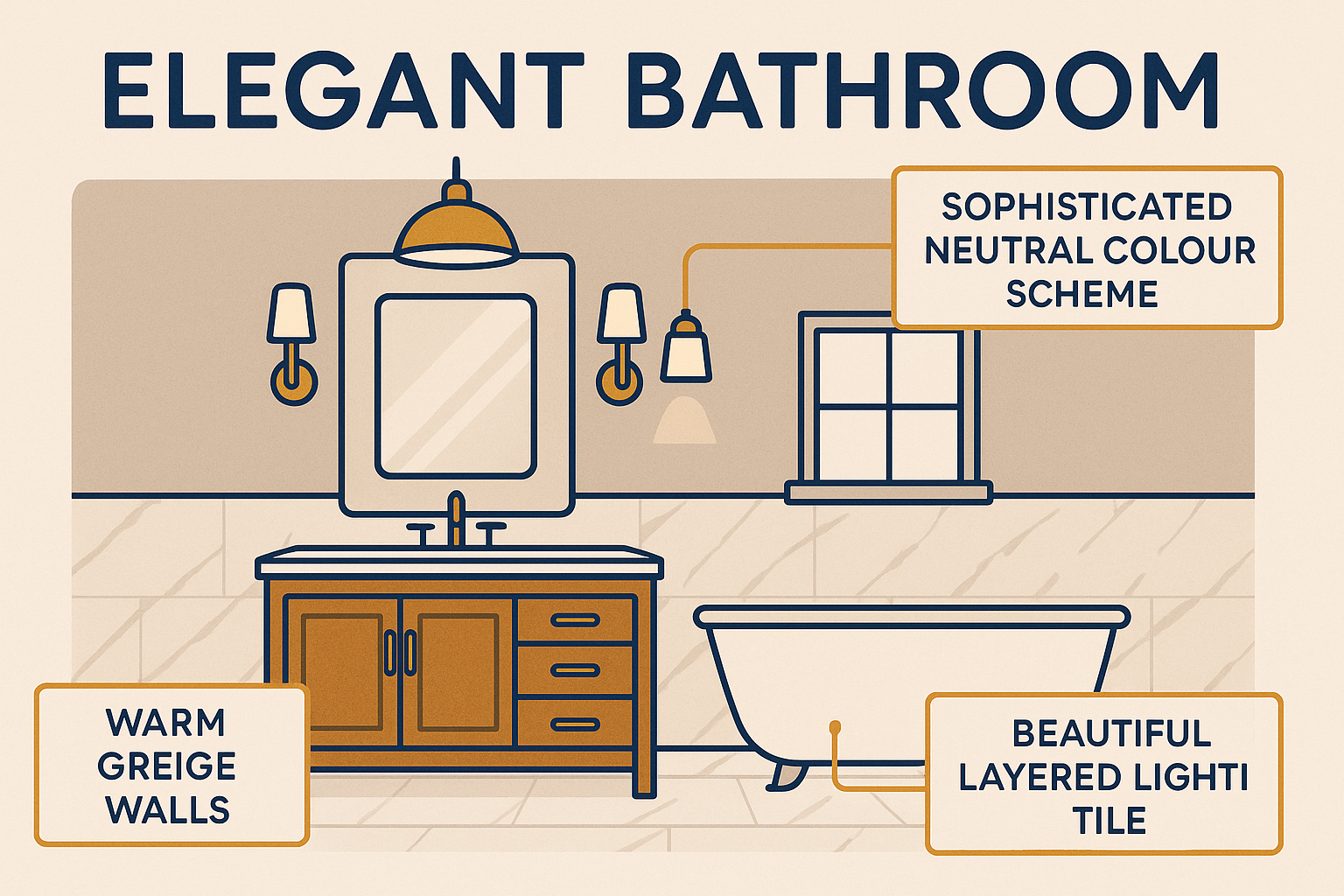
Neutral Palettes: The Case for White, Grey, and Greige
Neutral bathrooms remain the most popular choice in Ottawa renovations, and with good reason. White, off-white, grey, and greige (grey-beige) read as clean, timeless, and adaptable. They age well and photograph well, which matters for resale.
White is the default, but not all whites are equal. Cool whites (with blue or grey undertones) pair well with chrome and glass. Warm whites (with yellow or cream undertones) work better with brushed brass, aged bronze, or natural wood vanities. The wrong white can make a space look dirty or clinical.
Light grey is a reliable choice for walls or large-format floor tile. It grounds a bathroom without making it dark, and it provides contrast against white fixtures. Mid-toned greys can feel heavy in bathrooms with little natural light — test before committing.
Greige has replaced beige as the go-to warm neutral. It bridges cool tile tones and warm wood elements, which makes it forgiving when you have mixed materials.
Cool Tones: Blue, Green, and Slate
Cool-toned bathrooms — soft blue-greens, sage, slate, and navy — have become increasingly common in whole-bathroom renovations. They signal calm, cleanliness, and a spa-like quality that suits a bathroom’s function.
Soft blue-green and sage work well on walls and as accent tile, especially in bathrooms with natural light. They pair naturally with white tile, warm wood vanities, and matte black or brushed nickel fixtures.
Navy and deep teal function as feature colours on a single wall or in a powder room where bold choices carry less risk. A navy vanity against white tile and brass hardware is a look that holds up over time.
Slate and charcoal function almost as neutrals in contemporary bathrooms. Large-format charcoal tile on a shower wall reads as sophisticated when offset by white grout and bright white fixtures.
Warm Tones: Terracotta, Blush, and Taupe
Warm palettes are having a strong moment in bathroom design, particularly in whole-home renovations where the bathroom is meant to feel like a natural extension of living areas.
Terracotta and clay tones work best in bathrooms with natural materials — wood vanities, stone countertops, matte tile. They bring warmth to a space that can otherwise feel sterile.
Blush and dusty rose are softer choices that can feel either dated or timeless depending on execution. Paired with warm white tile and unlacquered brass fixtures, a blush bathroom feels elegant. Paired with chrome and bright white, it reads as an older look.
Warm taupe is the most versatile of the warm tones. It bridges timber, stone, and white in a way that greige does not — with more warmth.
Colour in Small Bathrooms
The instinct to use only white or very light colour in a small bathroom is understandable but not always necessary. Light colours do open a space — there is no question about that. But a dark, moody small bathroom done well feels intimate rather than cramped.
The real driver of perceived space is contrast, not just colour. A small bathroom with high contrast between wall colour and tile, or between vanity and wall, tends to feel busier and more confined. A monochromatic approach — where the walls, tile, and grout are close in tone — tends to make a space feel more cohesive and larger.
For a bathroom where size is a concern, the most reliable approach is:
– Keep walls and large-format tile in the same tonal family
– Use a lighter grout that recedes rather than defining every tile edge
– Reserve contrast for fixtures, hardware, and accessories, which draw the eye without fragmenting the space
Learn more about design strategies for compact bathrooms in our bathroom renovation services overview.
How Lighting Changes Everything
Bathroom lighting is the single biggest variable in how colour reads. The same wall colour looks different under an incandescent bulb (warm, slightly yellow), a cool LED (bright and blue-toned), and natural daylight (truest reading).
Before committing to a colour, test it:
– Paint a large sample directly on the wall
– View it in the morning, midday, and evening
– Check it under the specific bulbs you plan to use
Bathrooms with north-facing or no windows will almost always read cooler and darker than the paint chip suggests. Compensate by choosing a colour one to two shades lighter than your target, or by warming the lighting.
Backlit mirrors and vanity lighting with a high CRI (colour rendering index) rating give you the most accurate colour rendering. A CRI of 90 or above is the standard to look for in a bathroom.
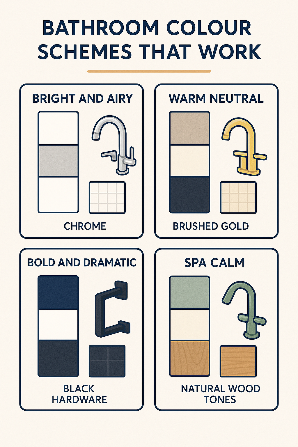
Coordinating Tile, Vanity, and Fixtures
A bathroom colour scheme is not just the wall colour — it includes tile, grout, the vanity finish, countertop material, and fixture hardware. Getting these to work together is where most homeowners struggle.
A simple rule: choose one material or element as the anchor and build outward. Most bathrooms anchor on the floor tile or the vanity.
- Anchor on floor tile: Choose floor tile first, then select wall tile that shares a tonal value. The vanity and hardware should either match the warmth of the floor tile or provide intentional contrast.
- Anchor on the vanity: Select the vanity finish first, particularly if it is a strong colour. Everything else supports it — tile should be more neutral, hardware should match the vanity undertone.
If you are planning a full renovation, working with a designer to sequence these decisions avoids the most common coordination problems. Our team at Miracle Dream Homes handles material selection as part of the renovation process — you can explore what that looks like through our tub-to-shower conversion page or our main service pages.
Common Colour Mistakes
Choosing colour from a small chip in-store. Small chips read differently than a full wall. Always test at scale.
Ignoring grout. Grout colour significantly affects the overall tone of a tiled room. White grout brightens but shows staining. Dark grout recedes and creates a grid effect that can make a space feel smaller.
Matching everything too closely. A bathroom where every element is the same shade of grey looks flat. Intentional tonal variation — slightly different values within the same colour family — adds depth without chaos.
Choosing trendy colours without considering resale. Bathroom colour schemes in the mid-range renovation market should balance personal preference against broad appeal if resale is a consideration. Neutral walls with bold accessories are a safer long-term investment than bold walls.
For authoritative guidance on how colour, light, and material interact in interior spaces, the Colour Association of Canada and Sherwin-Williams Color Forecast are reliable professional references.
Frequently Asked Questions
What is the most popular bathroom colour scheme in Canada?
Neutral palettes remain the most popular — specifically white and light grey combinations. These are chosen for their versatility, timeless appeal, and compatibility with a wide range of fixture finishes and tile materials.
Do dark colours make a small bathroom feel smaller?
Not necessarily. A dark, monochromatic scheme — where wall colour, tile, and grout are all in the same tonal family — can make a small bathroom feel more cohesive. The issue is contrast: high contrast between many elements tends to fragment the space visually and make it feel more confined than it is.
How do I know if a colour will look right under my bathroom lighting?
Paint a large test swatch directly on the wall and observe it at different times of day and under the actual bulbs you will use. Bathrooms with no natural light or north-facing windows read cooler than a paint chip suggests — choose a slightly lighter or warmer shade to compensate.
Should my grout match my tile or contrast with it?
Both approaches are valid. Matching grout creates a seamless, expansive effect that suits larger-format tile. Contrasting grout defines individual tiles and creates pattern — which works well with smaller tiles like subway or mosaic formats where the pattern is intentional.